Friday, December 20, 2013
Merry Christmas!
Off now for my birthday and Christmas and New Year and that.
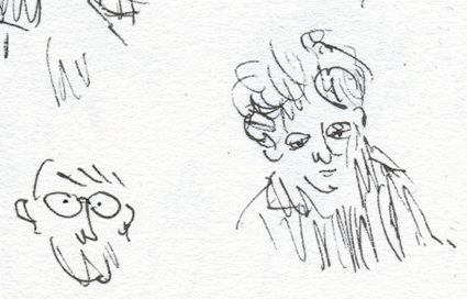
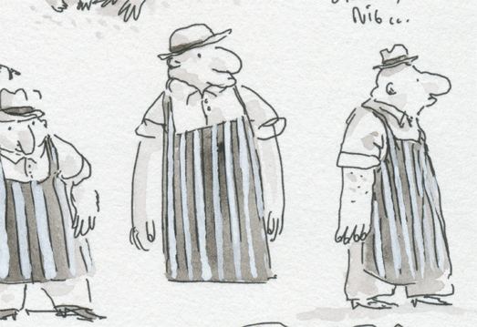
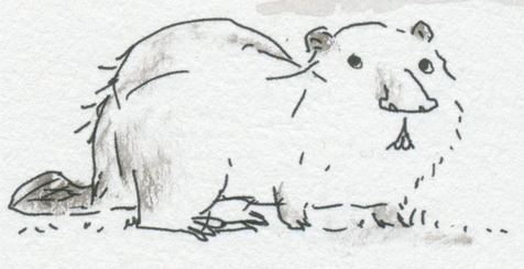
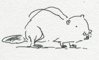
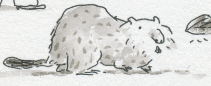
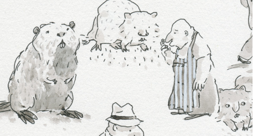
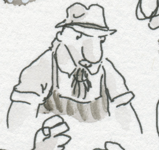
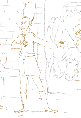
Here's a low resolution bonus, some creature consequences doodles that Alexis Deacon and I did the other day in the pub.
Tuesday, December 10, 2013
Digital and Handmade part 2
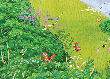
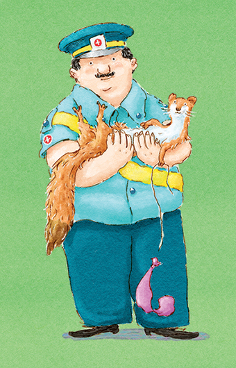
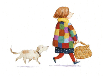
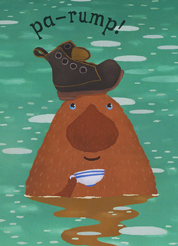
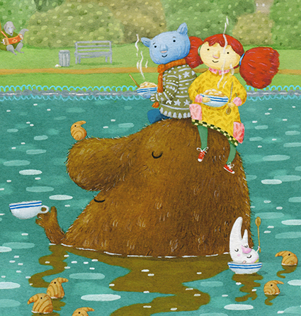
Ha, so the last "ten percent" of these illustrations took almost a month of solid work to get right! Barring changes from the publisher I'm going to let them go now. I can certainly say that the almost fully digital process that I used has not been good for my eyes. About 250 hrs of staring into the screen and mostly ignoring the system I'd set up for working standing up has left me feeling I need new glasses and a new back, and looking like I've been hidden in a cave for three months. (By the way these illustrations are for a book by Jeanne Willis, but more on the actual book in another post.)
Here's a couple of videos of the process where I pretend it's idyllic! That's mostly down to the music by my friends the Rheingans Sisters. You can see more actual drawing in the second one.
To cut a long story short I think I digitally painted myself into a corner with the technique. Just look at the layers for a typical spread!
But I did hugely appreciate the computer when I started to spot flaws in the underlying drawing towards the end (it is always the underlying drawing where there's trouble). Now time to wait and see how it looks in print.
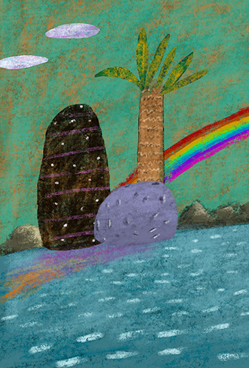
For this book I started with some digital experiments (that I did a while ago as a contribution to Over the Hills and Faraway, a collection of nursery rhymes to be published by Frances Lincoln some time soon) and took the technique to its logical conclusion; I did it with backgrounds. Little did I know what a challenge that'd be! In fact it didn't really start to work until I got some real paint involved there.
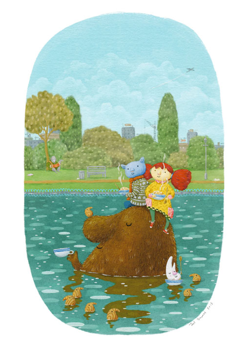
The main tools I used were custom Photoshop brushes that I first started work on when doing the kit for the Abney & Teal Picture books (which is still being used for this purpose by Davide Arnone).
I've refined and added texture to these brushes since. In the picture below I even left out some elements and finished the image with real paint over a giclee print.
Like many people I wonder about my concentration span in the digital age, though my mother says that when I was tiny she used to have to feed me in the dark as I was so distractible, and so perhaps it is just me. Given this, it's very helpful to be able to fix and change things as I go on the computer and make up for my lapses during the process. The book as a whole is the project after all, not individual bits of artwork.
I sometimes wonder about a certain generic feeling that seems to be creeping into illustration generally at the moment perhaps because of digital techniques, and the way we share work too, but I don't know, if you can improve or simplify your drawings why would you not? And it was ever thus, even if the circles of influence now turn especially fast. In certain ways visual literacy is probably at its highest point in history and I definitely need the help of machines just to be anywhere close to keeping up.
For me, a respite from worrying away at the skeuomorphic properties of the marks I'm making, and not just their purpose as part of a drawing, would be probably healthy. And for the sake of my eyes and my sanity I'm planning now to work on some simpler techniques that make more use of drawing and painting away from the computer. It's probably simplicity that's important though, more than running away from computers. When I get sucked into playing with techniques and mark-making, whether on paper or with pixels, all hope of writing my own stories goes out of the window.
All that said, and in direct contradiction to what I've said here and in the last post, I've been playing with drawing on an iPad because I'm still very curious about drawing with all sorts of computers. (Above is a quick doodle done using Procreate on an iPad Mini, with an obvious nod to the king of iPad pictures.)
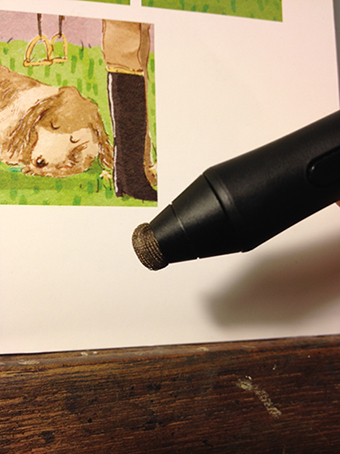
Here's an ultra-geeky tip: If you're using the Wacom Intuos Creative Stylus on one of the new iPads (Air or Mini with Retina Screen) you can make it behave much more naturally by removing the rubber tip and tying with thread a piece of conductive cloth (available online) around the metal tip, just loosely enough to behave like a stubby brush. (Apparently this very costly pressure sensitive stylus behaves better out of the box on earlier machines).
Monday, November 11, 2013
Digital and Handmade
I am currently about ninety percent (I hope) of the way through what is, depending on exactly which books you count as having been fully illustrated by me, my twentieth illustrated book. I have used a computer in some fashion for seventeen of those books. For this book I've hardly been near real paper at all. And now I feel pretty funny.
(A crop from some work in progress from my twentieth illustrated book. Apart from some watercolour textures and some paper textures built into custom photoshop brushes the pictures are being done entirely on a computer.)
I'd like to try to order some of my thoughts about working with computers.
At the end of his first Reith lecture, Democracy Has Bad Taste, (about 38mins in) Grayson Perry responded to a statement (cunningly disguised as a question) from Will Self, regarding the "haptic quality", the handmadedness of Grayson Perry's work, with a dismissal of the fetishising of the handmade. It was a slippery statement of his own, but there is so much going on in these statements and questions. Things I don't have any answers to (but probably a deal of statements).
I'm fond of pulling people up when they refer only to the non-digital as being hand-made, as though those of us working with Wacom tablets or Cintiq screens* made the computers do all the work with our hands tied behind our backs. You know, the way that CGI just comes out of the back of a computer when you post a movie budget in the slot on the front, and those CG designers and animators don't do a thing, all night, snatching sleep under their desks to bring scenes in on time.
(*I left out iPads, since it seems that David Hockney might be the only person on earth to conjure a worthwhile image from what ought to be the most handy of the anti-handmade devices. I've also heard iPads referred to as truly handmade objects. Handmade by workers in purportedly appalling conditions. How do I know? Those workers might be no worse off than those animators, sleeping under their desks.)
But, to attempt stay just about on track, there is a gut feeling in most statements about the hand-made. Making something without a computer does feel different to the maker. And the thing about drawings and pictures is that they are very good at conveying feelings. Also the term "in meat-space" doesn't have quite the same ring to it.
(The cover of one of my first books. Painted on paper with acrylic and watercolours. Published in 2002)
The fact that the first three books I ever illustrated were painted "by hand" had more to do with publishers not being used to illustrators using computers than with my desire to work solely on paper. At that point the received wisdom seemed to be that computers were only for designers, and who was I to argue? Although my preferred technique at the time was to collage watercoloured drawings together with paper textures on the computer, I decided to use acrylic paint so that I could correct and make changes as far as possible without starting each image from scratch. Still, I remember painting the cover of my first book a full five or even six times over. The colours came out well, (in fact I'm not convinced I've got near them since) but I felt that the technique knocked whatever scant fluidity there was right out of my drawings. That fluidity is important to my feeling good about drawings, though it often seems as though people respond more to colour.
(Illustration from the Jabberwocky by Lewis Carroll. I used Ink, watercolour, and digital collage. Fluid? Well, almost, but it was an absolute joy and a relief to put this together after the laboured paintings I had been doing "by hand". Published in 2003)
All this took such a long while that in the mean time other illustrators had been hassling publishers to let them use computers, and at last I was allowed to use the technique I'd intended from the start. I immediately discovered that most of the fluidity I imagined I had dissipated completely under the pressure of making a whole book, whether I had access to a computer or not. So I set about finding all sorts of weird ways to trick myself into not worrying so much about making drawings.
(Illustration for The Little Mermaid by Hans Andersen. Drawn using typewriter carbon and watercolour, with other elements collaged digitally from chalk pastel drawings on coloured paper. Published in 2004)
One method that stuck for several books was that of tracing my rough drawings onto watercolour paper with typewriter carbon (already rare enough a substance that it had to be ordered using a computer). Because I couldn't see the final drawing while I was drawing (it was underneath the carbon paper), I felt better about the mark making. The drawings came out with a sort of rigid roughness that kind of worked. They were awkward, but in a way that I felt was mine. This technique hurt my hand though, so it couldn't last.
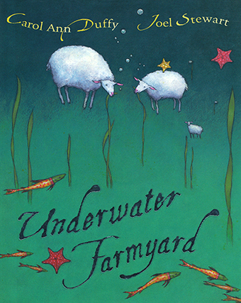
(An illustration from Moon Zoo, written by Carol Ann Duffy. The drawing was done with typewriter carbon and watercolour, and all else was collaged together from "hand-made" pieces. Published in 2004)
Towards the end of making the final book done using this carbon paper technique I was asked to colour a lot of images that I had done in black and white and for the first time I used brushes in photoshop. I was not too impressed with the result, but was sure that was my fault and not just the limitations of the software.
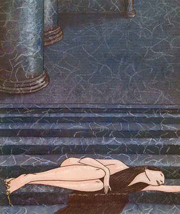
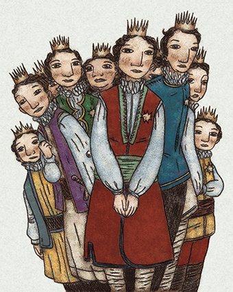
(Illustration from The Wild Swans by Hans Andersen. Coloured with digital brushes.
That awkwardness I mentioned! Probably made even stronger by the fact that the characters in the picture were originally drawn naked, before I was asked to draw them again with clothes. This was one of the first images I ever tried to colour with photoshop brushes. Published in 2004)
While colouring a book for someone else's B&W drawings I worked out a digital colouring technique that used textures from an analogue photocopier (modern photocopiers scatter dots everywhere and don't give the same textures at all) screened over digital colour, giving a result that wasn't quite watercolour or old four-colour process or aquatint, but had something of the feel of all those. A bit washed out colour-wise, but as a technique it gave so much freedom to separate the drawing from the colour! At the same time I picked up the idea of soaking drawing paper in linseed oil from a friend who drew pencil drawings that way. I tried ink and found that the way it bled and misbehaved once again stopped me worrying about mark-making and got me through the pressures of drawing to order. As I recall it took about a twelve inch thick pile of "meat-space" sketchbooks to work that technique out!
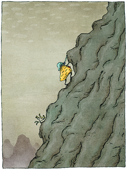
(Illustration from When a Zeeder met a Xyder, by Malachy Doyle. Drawn in ink on oiled paper. Textured and coloured on the computer using texture from an analogue photocopier. Published in 2006)
It was becoming clear to me, however, that the reason I needed to trick myself so often, or to find ways of making awkwardness work for me was really all to do with my drawing. The only solution was to draw more and get better at it. To this day my ability to draw a really nice drawing followed quickly by an utterly appalling one where I appear to have forgotten everything I ever learned astounds me.
(Illustration for The Silver Sovereign by Eoin Colfer. Drawn quickly on layout paper, printed onto watercolour paper with a computer, then painted. Published in The Birthday Book in 2008)
(Two utterly appalling drawings where I appear to have forgotten everything I ever learned. Believe me there are many worse ones, but these were the worst I could bring myself to post.)
It's taken me more paragraphs than I'd meant to get me up even to work published five years ago, and all this doesn't really cover my experience of making things completely digitally. Perhaps I can continue in another post, (anyone read this far? Let me know!). I really need to get on with turning ninety percent of a book into a hundred percent of a book. If experience has taught me anything, it'll take more than another ten percent's worth of effort with or without a computer.
Meanwhile here are some thoughts on similar from some fellow illustrators:
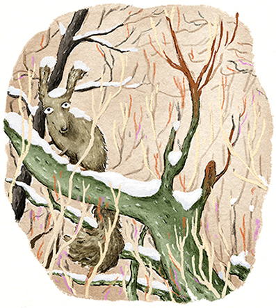
Points 9 and 10 regarding digital colouring in Sarah McIntyre's blog post here resonate with me very much. As do Alex T Smith's points about hurting eyes.
Tuesday, October 15, 2013
Fun Raising
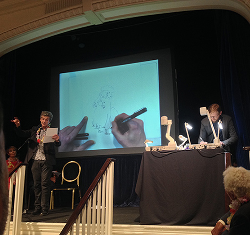
Sitting behind the big screen at the House of Illustration's 'Open Doors' campaign fundraiser, as drawing after drawing unfolded (backwards, since we illustrators hid round the back with the projector), I was totally swept up by the magic of it. Most of us get nervous or jumpy about drawing in public individually, but every drawing by every illustrator that I watched put down on those scraps of paper and up on the screen looked like, well, magic of the best kind. Huge thanks are due to Emma Chichester Clark for getting us all together.
Last up was Master Magician Sir Quentin Blake, and I think I speak for at least one generation (and probably a couple more) of illustrators when I say that his work is not even so much an influence as part of our very make-up, having breathed it in since early childhood. Watching him at work was totally joyful.
And yeah, I got to do my bit while Doctor Who, I mean Peter Capaldi (his days as himself, or even Malcolm Tucker are probably already over aren't they?) read aloud.
The picture and video were taken by Andrea MacDonald.
Here is a list of all the illustrators who were up on stage during the reading from Lewis Carroll's the Hunting of the Snark: Marion Deuchars, me, Chris Riddell, Polly Dunbar, Sam Usher, and Sir Quentin Blake.
The readers were: Peter Capaldi, Simon Russell Beale, Celia Imry, and Joanna Lumley.
And the room was full to the brim with other great drawers, several of whom were up and drawing after the reading. Tor Freeman, Viv Schwarz, Benji Davies, Steve Lenton, Alex T Smith, David Roberts, Bruce Ingman... the list goes on and on beyond what I remember, or who I had a chance to meet.
Huge apologies to those I've forgotten. And everyone should look gravely at the pun in the headline.
Monday, September 23, 2013
House of Illustration Fundraiser
Tuesday, September 17, 2013
http://joelestewart.tumblr.com
I've started posting observational drawings and experimental paintings on a Tumblr page. So far I've put up pictures covering the period from 2007 to 2009 to rescue them somewhat from the ancient bottom end of this blog and my old Livejournal account. Hopefully soon I'll catch up with myself and maybe then it'll become a place to put current work.
Monday, September 9, 2013
Abney & Teal on DVD
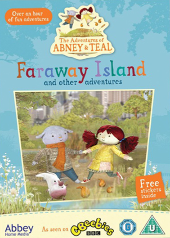
So far as I know (and that isn't very far) the first Abney & Teal DVD is released today! It is called Faraway Island and other adventures and contains eight episodes.
I don't actually have a copy, so I don't know which episodes are featured. I think they are not in series order as I do vaguely remember being asked, many moons ago, to check over a selection of themed collections with titles like this one.
Wednesday, September 4, 2013
Over-thinking inking
These are some line and wash drawings done mostly to get my mind rolling on an event that I'm doing in a month or so. I haven't got much detail on that event yet, so they may be pointless in that regard, but we'll see.
They are in some ways quite opposite to the colour work I'm doing, but it seems like I have to do opposite things in B&W to achieve the same goal. I think that the fairly uniform weight of line has a similar effect in B&W to using a light outline, or none at all in colour. I don't think I've really used line quite like that since I made monoprints using typewriter carbon for Moon Zoo and the Hans Christian Andersen book, but I hope my drawing's improved since then. I'd like to be braver with what I leave out (conversely I seem to be putting a lot more into the colour work). I've certainly become braver with noses, even if they've always been a feature!
I am a high achiever when it comes to over-thinking even the simplest elements of drawing. And yet, to misquote somebody or other, talking about drawing is a bit like dancing about architecture.
Monday, August 19, 2013
Dabbling and dabbing
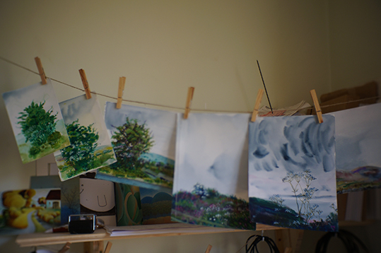
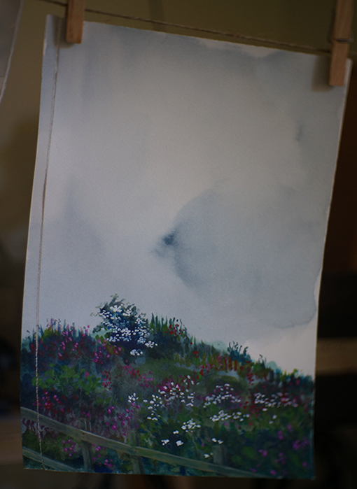
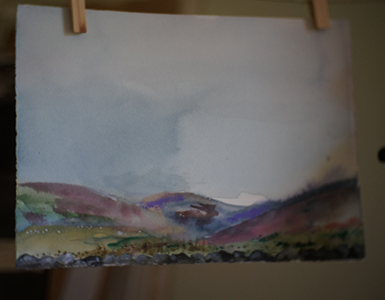
The waiting game is mostly back on with book projects, so I'm trying to use the opportunity to work some stuff out with watercolour, gouache, and old reference pictures and sketches. I'm mostly thinking about trying to find form that's not photographic, whether the reference is or not. But also just chasing pigment suspended in water.
Thursday, August 1, 2013
News?
Goodness, over a month and nothing new here.
I'm working on roughs for two picture books, and these roughs are either nothing special to look at, and/or give away the whole point of the book in one go. Perhaps when a bit more final artwork is underway I can show some more.
Also some news re. prints is hopefully on the horizon.
Subscribe to:
Posts (Atom)